

Hi everyone! I had a lot of fun putting together the first version of this post, my Twitter UX teardown. Here’s my second one – a critique of AirBnB‘s website.

This one took me a little while because I’ve used this site much less than I’ve used Twitter, so the critiques didn’t come as easily. It was definitely a good learning experience!
This teardown is for a project for Viking Code School, for one of the first assignments in the Web Design unit.
The questions I’m answering (in purple) have been provided by Viking Code School.
Who is the key user? This isn’t always clear, especially in marketplace sites, so take your best guess.
Someone, probably pretty young (millennial demographic especially) who is interested in travel
What is that user’s number one critical goal when using the site? Be as specific as possible if there are multiple options here, e.g. “to purchase a red wagon” instead of “buy a toy”.
To locate travel arrangements to a specific place for a specific time (better for looking for something specific than for browsing)
What is likely to make that user’s experience particularly positive (i.e. provide good satisfaction)?
Being able to sort listings by useful criteria, like time period available, location, price, and type of rental, so that they can quickly locate listings which are most suited for them. This is the same goal of people who are listing their properties, because people being able to sort specifically and find what they want guarantees that more suitable people will look at their listing than if those people were just browsing aimlessly.
What is the approximate information architecture of the site? (sketch it out)
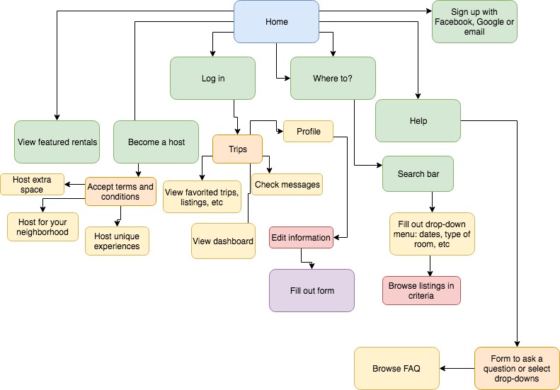
What is the flow through that architecture for the user who is accomplishing the critical goal you identified above?
They use the search bar to enter their criteria (dates, location, type of rental and possibly price range), then browse listings that fit those criteria. Once they find a listing they like, they can “star” it for later, add it to a folder for a trip, or contact the rentee to see about renting the listing. Note: all of these options are only available to someone who is signed in. Browsing is available without an account, but if the user doesn’t have an account signing up is an extra step that will need to happen before they can take any action.
What style(s) of navigation is/are used? Do they answer the key questions (Where am I and how did I get here? Where should I go next and how do I get there?)?
The most common style of navigation is the drop-down menu: it is used to tick boxes to apply filters to searches so that users can find suitable listings quickly. From there, the main method of search is scrolling through listings with their images being the most prominent thing people are looking at. They answer the key questions pretty well – you never have to wonder what you’re searching for or how you ended up where you are because the search results are so personalized.
What key interactions does the user have? Are they clear and usable?
The key interactions the user has are the search bar and filter, creating a profile (more important than on some sites, because you need a working and verified profile to be able to book or list properties), and going through the process of booking. I didn’t go through and try to book something, because without a verified profile you’re blocked partway through the process, but the search bar works very well and produced a lot of properties that were clearly within the parameters. Creating a profile was simple, but I think it could be easier to navigate to. It’s not super intuitive, to me, that I would need to create a full profile (on sites like this, customization is usually the last thing I do, because I want to spend more time actually browsing the listings). I think more clarity about the process itself (maybe a thorough walkthrough on the homepage, or a demo) would be really helpful.
What did the site do well to allow the user to accomplish his goal effectively, efficiently and with good satisfaction?
The site basically prompts you to do each step. The first and most prominent direction is to search for properties, and then once you find them and click on them, the “Request to Book” button is very prominent. I think it walks through the process really well as you’re completing it, and is easy to use as long as you know what you’re doing.
What did the site do poorly when allowing the user to accomplish his goal effectively, efficiently and with good satisfaction?
One of AirBnB’s main advantages is also one of its disadvantages – because you are walked step by step through the process, it’s difficult to have a clear line of sight as you’re completing the goal. For example, it’s difficult to tell how long it will take to get from searching to applying to rent a listing. It’s also unclear what the steps are for actually renting, the main goal of AirBnB, without some digging. As someone who has never actually used the site and only has a general idea of how to use it from my clicking around, I personally would appreciate a little more information on the process before embarking on it.
That’s all this time, folks! If you’re reading this, thanks. I know these are rough, but I can’t wait to learn even more and put that knowledge to good use.

1 Comment